Top 10 Logo Redesigns
Our Best Before and After Logo Transformations
Your logo is often the first impression you make, and sometimes it makes the wrong impression. From outdated or generic to downright ugly, we’ve seen it all! And while a brand is more than just a logo, it is an important element to get right. A great logo not only captures the essence of your brand but also resonates with your audience.
We've had the pleasure of redesigning many logos over the years and here are some of our favourite before and after transformations!
1. Randolph College for the Performing Arts

Randolph College in Toronto needed a fresh, authentic, and inspiring brand that truly reflects what they do, who they serve, and how they are different. The old logo missed the mark. The new design and color palette we created incorporate movement and artistry, married with a professional, academic look. The new logo and branding elements are a true reflection of the essence and personality of Randolph College. See the full project here.
2. Modern Caregiving Solutions

Modern Caregiving Solutions old logo was generic and unmemorable, with drab and uninspiring colors. Their branding didn’t reflect their mission to be change makers and innovators in combating systemic healthcare inequities and paving the way for inclusive caregiving. The new, bold, and modern logo is a true reflection of the essence and personality of Modern Caregiving, bringing clarity, focus, and vibrancy to their mission. See the full project here.
3. Alive Dental

It was time for a new name and brand for Aronson Family Dental. A decision made based on the business evolution and positioned for future growth. We decided to pay homage to the old logo by incorporating the leaf, this time growing out of the name – literally bringing the name to life. The new name, logo and colour palette are a perfect reflection the essence of the brand for Alive Dental. See the full before and after here.
4. Conscious Leaders Quest
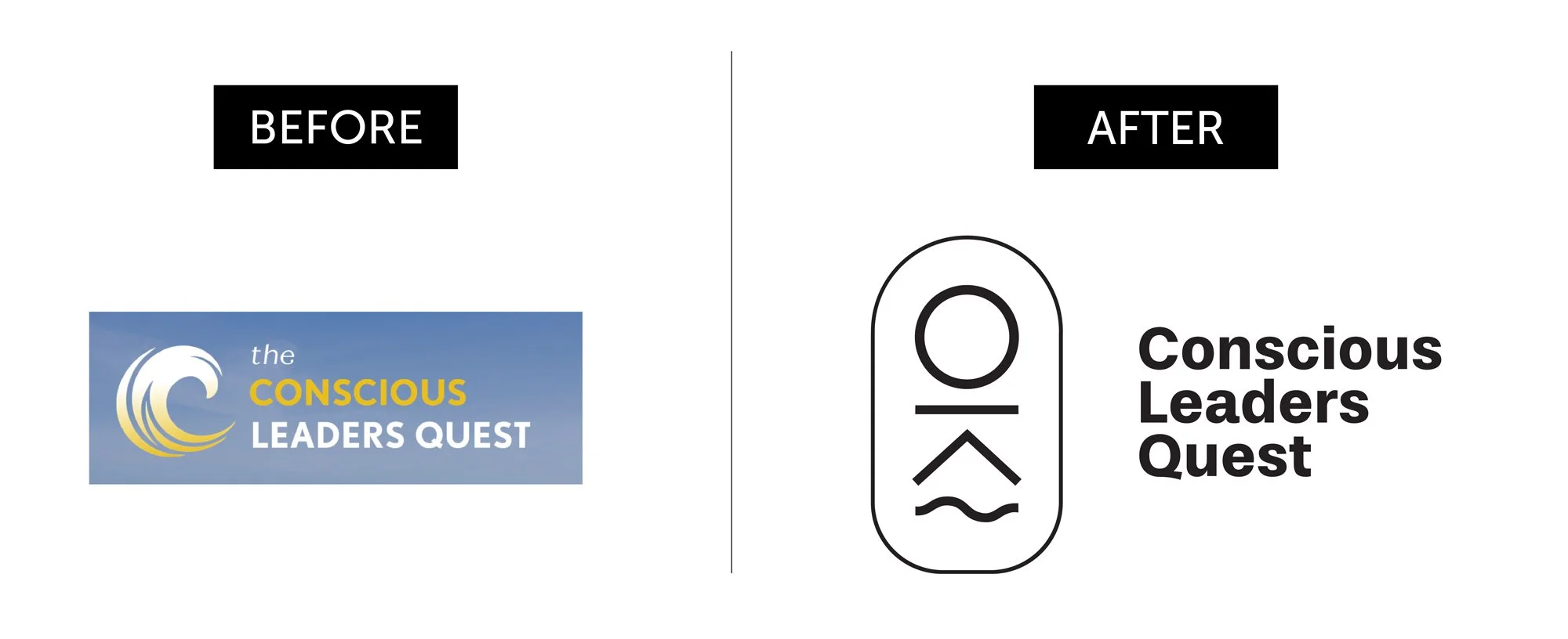
The old logo for Conscious Leaders Quest was hastily created and lacked depth the founders desired. It failed to capture the essence of their transformative leadership adventures and expanded vision for the future. Our new logo integrates symbols representing their process of Connection, Ritual, Adventure, and Wisdom, and aligning perfectly with their brand mission. This transformation has elevated their visual identity to match their impactful work. See the full before and after.
5. Masten Pools

Masten Pools had been in business for close to 40 years before we worked together and not much had changed since its inception. Their logo was outdated and resembled every other pool company logo out there. We created a fresh, fun and modern new design to capture the essence of the brand and fit the new vision for its future. Click here to see the full before and after.
6. Medusa Media Group

Simply Put Strategies has a generic name and logo, and the owner, Eva Janotta, never loved them. We helped her create a powerful new business name – Medusa Media Group. The new name and sleek new logo fit Eva’s desire to help women defy the status quo and amplify their influence through thought leadership. See the full project here.
7. Guardian at the Gateway

Guardian at the Gateway’s old logo was too busy and lacked sophistication. Businesses in the spiritual realm often appear cheap or too ‘out there,’ so we knew we needed to position it differently. We retained the concept of the wings but created a cleaner, more elegant, and memorable visual brand. See the full before and after here.
8. Tridome

The old Tridome logo and color palette blended in with their competitors. Our goal was to create a logo that would break free from the industry norms, capturing attention and bring personality into their brand. Their new logo captures the essence of their business and the work they do. Click here to see the full before and after.
9. Diane Sorensen

Diane Sorensen felt disconnected from her brand. Her logo was cute but didn’t authentically represent her and the works she does. She helps her clients break generational patterns, cultivate deep connections, and lead their lives with confidence. Her new logo beautiful illustrates this and now she feels completely connected to her logo! See her full rebrand on our instagram!
10. Dr. Lisa Watson

Dr. Lisa Watson’s old logo was generic and didn't capture her personality or unique style of care. Lisa is not your typical Naturopath – she's bold, dynamic, authentic, and inspiring. With her striking red hair and lips, she needed a brand that truly represented her vibrant persona. The new design draws inspiration from her tagline – "From burnt out to fired up." The phoenix symbolizes rebirth and regeneration, perfectly encapsulating her approach to care. Lisa now has a logo that authentically represents her and her practice.
But remember it’s not just about the logo…
These transformations are not just about new logos; they are about capturing the essence of each brand and making a lasting impression. The meaningful, memorable, and authentic logo designs you see here are the result of our deep dive through Brand Camp.
Brand Camp is where the magic happens. It’s where we uncover the heart and soul of your business, ensuring that every element of your brand resonates with your audience and stands the test of time.
If you want a logo with as much meaning as these examples, book a call with me today and let’s talk about working together!